Visualizations of 19th Century Travel Data
This collection of maps and graphs are primarily a visualisation of the information contained in the “Skeleton Through Routes” section of Bradshaw’s 1887 and 1888 railway guides.[1] These tables list over two hundred destinations from London, and accompanying routes (including modes of transport), estimated journey times and first and second class ticket prices. A full list can be found in the “Data as is” sheet of this spreadsheet.
These maps attempt to use the information from Bradshaw’s guides to show where British tourists wanted to go, how they got there, and how they encountered different nations along the way.
The main visualisation is this geospatial network graph. Unfortunately the file type cannot be embedded online, but can be visualised in Google Earth. You can access the .kmz file here.
Figure 1. Geospatial Network Graph.
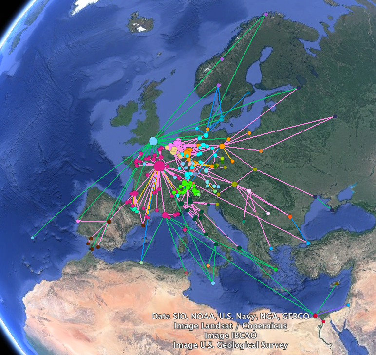
Each node represents one of the destinations in Bradshaw’s table. The colour is determined by the column of the table that provides what can best be described as the country of the destination, although as the map shows, that column does not quite map onto national boundaries. For example, some German towns are labelled part of “Germany,” some by states within the German Empire (e.g. “Prussia,” or “Bavaria”) and some by geographic location (“Rhine”). This perhaps provides a glimpse into the hierarchy of interests of British tourists: tourists hoping to go mountaineering would find the designators “Pyrenees” and “Tyrol” more useful than “France” and “Austria,” while those areas that did not present specific geographic interest were most meaningfully labelled by country. The patchwork of such labels in Germany perhaps shows that British tourists did not think of Germany as a single entity, but as a collection of discrete if overlapping areas. In the same way that Poland was thought of as separate from Russia despite being part of the Russian Empire, so too were German states separate from the German Empire. Furthermore, the enormous cluster of destinations stretching down the Rhine shows the popularity of that region for British tourists. Other such clusters are the French coasts on the English Channel and Mediterranean, Switzerland and the Pyrenees. While such a visualisation is slightly misleading, as it shows the number of destinations in a certain area, not necessarily how many people travelled to each one, such clusters do certainly indicate the existence of strong interest among would-be travellers in certain regions.
Each node (clickable in Google Earth) contains information on the place name as given in Bradshaw’s, country, current name, minimum journey cost in pounds and in the number of weeks the median worker in 1886 would have had to work to earn that much, the cheapest route, and the minimum journey time in hours and equivalent route.[2]
The lines link those points listed as destinations, showing routes from London. This should not be thought of in any way as a comprehensive map of European travel connections, but as one focussed on the paths from London to different destinations, broken up into stages by the other destinations listed in Bradshaw’s that one would have to stop at on the way to one’s final destination. Lines are colour coded by mode of transport. Links by railway are pink, steamer green and diligence (carriage) grey. Links that would involve travelling by rail and steamer are blue, rail and diligence yellow/orange and steamer and diligence purple. One of the most striking features of this visualisation is the degree to which travel centred on Paris, especially within France, and the comparison between the centralisation of the French travel system and the apparently decentralised form of the German travel system at this time. British travellers would have encountered France, and much of Europe, via Paris.
The following visualisations are intended to provide some of the information in the geospatial network graph above in a web-accessible format. The former simply shows the nodes as clickable points, each of which when clicked displays the same information as the nodes in the network graph (both are visualisations of the same spreadsheet). The network graph below that shows the links in the geospatial network graph (again from the same spreadsheet).
Figure 2. Interactive Map.
Figure 3. Network Graph.
These two charts show the destinations weighted by minimum cost and then journey time. Unfortunately, to enable Google Sheets to find the right locations, the modern names of the places are used, not the names as listed in Bradshaws. Perhaps unsurprisingly, they show that the cost of a journey increased significantly for British tourists as they went beyond Northern France, Belgium and the Northern Rhineland, while the increase in journey time did not increase in quite so stark a proportion. Admittedly, these maps slightly overemphasise that discrepancy as the upper bound on journey time is much greater than the upper bound on cost, yet that is a relatively small issue, as the circles are sized proportionately to one another, so a destination with a price twice as large as another is shown by a circle twice as big. The second phenomenon these maps show is that steamer travel was a lot cheaper than rail travel, as can be seen from the much smaller dots lining the coast (for example, St. Petersburg was a lot cheaper to travel to than Moscow). Yet at the same time, railway was a lot quicker than steamer, as can be seen by the enormous size of the dots for Malta and Cyprus on the journey time map, both which could only have been reached by sea. An interesting topic for further research might be the link between class and different forms of transport, and the destinations those forms of transport opened up. Perhaps the wealthy converged on Switzerland and the Rhenish spa towns because they were expensive but quick to reach.
Figure 4. Destinations by Minimum Cost.
Figure 5. Destinations by Minimum Journey Time.
Figure 6. Plotted observations of travellers.
This last map attempts to show how British travellers encountered Europe, by showing the observations of tourists in relation to where they made those observations.[3] While limited by the number of quotes found—this was a byproduct of research for my final paper, not an attempt to map everything these travellers observed—it does give some context to both the travellers’ observations and the map of destinations.
Notes.
[1] Bradshaw’s Continental Railway, Steam Transit, and General Guide, For Travellers Through Europe 480 (May, 1887),1–8; Bradshaw’s Continental Railway, Steam Transit, and General Guide, For Travellers Through Europe 496 (September, 1888), 1–8. As both copies had pages missing, for those absent from the 1888 edition information from the 1887 copy was used. From comparing the two it does not seem as though this section varied between the two editions.
[2] The income data is from “Earning percentiles (shillings/week), 1886-1960,” Living Standards in Britain, 1870-2010, University of Sussex, accessed December 3 2016, http://www.sussex.ac.uk/britishlivingstandards/othersurveys/1870-2010.
[3] Bibliography for this map:
Asquith, Margot. An Autobiography. New York: George H. Doran Company, 1920.
Forster, E.M. The Journals and Diaries of E.M. Forster. Edited by Philip Gardner, volume 1. London: Pickering & Chatto, 2011.
Herbertson, A.J., and E.D. Herbertson. The Senior Geography. Oxford: Clarendon Press, 1911.
Hutton, R.H. Holiday Rambles in Ordinary Places: By a Wife With Her Husband. London: Daldy, Ibister & co., 1877.
Lee, Vernon. The Sentimental Traveller: Notes on Places. London: John Lane, The Bodley Head, 1908.
Mahtab, B.C. Impressions: The Diary of a European Tour. London: The St. Catherine Press Ltd., 1908.
Stather Hunt, W.R. Wanderings Before the War. London: Heath, Cranton Ltd., 1915.